
Computing a Power Spectrum from a Hydrodynamic Simulation#
kspace can also be used to analyze scalar and vector fields extracted from cosmologial simulations. Here we will show how to extract adaptive mesh refinement (AMR) data from a FLASH simulation of a galaxy cluster with sloshing gas.
from kspace import FourierAnalysis
import matplotlib.pyplot as plt
import yt
import numpy as np
# Load the dataset
ds = yt.load_sample("GasSloshing/sloshing_nomag2_hdf5_plt_cnt_0150")
/Users/jzuhone/Source/field_kit/.venv/lib/python3.13/site-packages/tqdm/auto.py:21: TqdmWarning: IProgress not found. Please update jupyter and ipywidgets. See https://ipywidgets.readthedocs.io/en/stable/user_install.html
  from .autonotebook import tqdm as notebook_tqdm
yt : [INFO ] 2026-08-11 14:23:27,800 Sample dataset found in '/Users/jzuhone/Data/yt/test_outputs/GasSloshing/sloshing_nomag2_hdf5_plt_cnt_0150'
yt : [INFO ] 2026-08-11 14:23:28,224 Parameters: current_time = 1.1835090993823291e+17
yt : [INFO ] 2026-08-11 14:23:28,224 Parameters: domain_dimensions = [16 16 16]
yt : [INFO ] 2026-08-11 14:23:28,225 Parameters: domain_left_edge = [-3.70272e+24 -3.70272e+24 -3.70272e+24]
yt : [INFO ] 2026-08-11 14:23:28,225 Parameters: domain_right_edge = [3.70272e+24 3.70272e+24 3.70272e+24]
yt : [INFO ] 2026-08-11 14:23:28,225 Parameters: cosmological_simulation = 0
To get a sense of what the data looks like, plot a slice of the density and temperature to see what it looks like, and annotate the slice with velocity vectors.
slc = yt.SlicePlot(
    ds,
    "z",
    [("gas", "density"), ("gas", "kT")],
    width=(1.0, "Mpc"),
)
slc.annotate_velocity()
yt : [INFO ] 2026-08-11 14:23:28,514 xlim = -1542838790481162406985728.000000 1542838790481162406985728.000000
yt : [INFO ] 2026-08-11 14:23:28,514 ylim = -1542838790481162406985728.000000 1542838790481162406985728.000000
yt : [INFO ] 2026-08-11 14:23:28,515 xlim = -1542838790481162406985728.000000 1542838790481162406985728.000000
yt : [INFO ] 2026-08-11 14:23:28,515 ylim = -1542838790481162406985728.000000 1542838790481162406985728.000000
yt : [INFO ] 2026-08-11 14:23:28,517 Making a fixed resolution buffer of (('gas', 'kT')) 800 by 800
yt : [INFO ] 2026-08-11 14:23:28,596 Making a fixed resolution buffer of (('gas', 'density')) 800 by 800


So we can see that the simulation has spiral-shaped bulk motions that are decaying into turbulence in the center. Since the simulation is AMR, we need to extract a regular grid of velocities to work with kspace. First, set up the parameters for a grid centered on the domain center, 400 kpc on a side, resolved by 128 cells on a side:
W = ds.arr([400.0] * 3, "kpc")
ddims = [128] * 3
c = ds.domain_center.to("kpc")
le = c - 0.5*W # left edge
re = c + 0.5*W # right edge
Now we use these parameters to construct the grid:
grid = ds.r[
    le[0] : re[0] : ddims[0] * 1j,
    le[1] : re[1] : ddims[1] * 1j,
    le[2] : re[2] : ddims[2] * 1j,
]
and set up an instance of FourierAnalysis to match the grid:
# This is a class I wrote to simplify stuff
fa = FourierAnalysis(W.v, ddims)
Now we query the grid for the velocity in the x-direction, converting it to units of km/s:
# Get the x-velocity field in km/s on the grid
vx = grid[("gas", "velocity_x")].to_value("km/s")
The next line demonstrates an important consideration. FFTs assume the data is periodic. However, in a system such as this, that is clearly not the case. If you take the FFT of a non-periodic signal, you can get effects of aliasing and spectral leakage. To mitigate this effect, we can apply a window function to the data which will bring it smoothly to zero at the boundaries, minimizing these effects:
vxw = vx.copy() # copy so that we have the original data kept separate
fa.window_data(vxw) # this uses a "Tukey" filter by default
Now we will take the power spectra of both the windowed and unwindowed data:
# Get the power spectrum of each spatial component
nbins = 60  # Number of bins for the power spectrum, it will
# use the min-max wavenumbers as boundaries
k_bins, Pk = fa.make_binned_powerspec(vx, nbins)
kw_bins, Pkw = fa.make_binned_powerspec(vxw, nbins)
and plot them:
# Take the geometric mean of the bins since they are logspaced
k = np.sqrt(k_bins[1:]*k_bins[:-1])
kw = np.sqrt(kw_bins[1:]*kw_bins[:-1])

fig, ax = plt.subplots(1, 1, figsize=(8, 6))
ax.loglog(k, Pk, label="Unwindowed")
ax.loglog(kw, Pkw, label="Windowed")
ax.set_xlabel("Wavenumber (k)")
ax.set_ylabel("Power Spectrum (Pk)")
ax.set_title("Power Spectrum")
ax.legend()
<matplotlib.legend.Legend at 0x11efc5fd0>
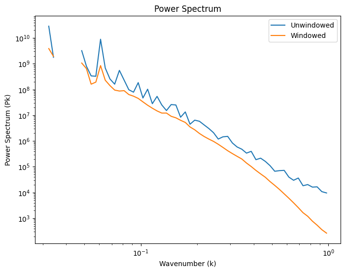
In the unwindowed (blue) spectrum, there are high-frequency components of the velocity signal associated with the sharp edges at the boundaries that have frequency components higher than the Nyquist frequency that get aliased back onto the lower wavenumbers, making the unwindowed spectrum noisy and flatter at high wavenumber. By contrast, the windowed (orange) spectrum has aliasing suppressed and the spectrum looks more physical. However, the windowing changes the velocity signal by suppressing it at the edges, resulting in a decrease in normalization.